How Mobile-Friendly Website Design Helps London Businesses Grow Online
In a fast-moving city like London, people are always on the go—commuting on the Tube, walking between meetings, or browsing while waiting in a café. In these moments, smartphones become the primary gateway to the internet. For businesses, this shift has completely changed how customers discover, interact with, and choose brands. A mobile-friendly website is no longer a “nice-to-have.” It’s a core part of digital success. If your site isn’t optimized for mobile users, you’re likely losing potential customers before they even get to know your business. Let’s explore how mobile-friendly website design directly contributes to business growth in London and why it should be a top priority. The Rise of Mobile Usage in London London is one of the most connected cities in the world. With high smartphone penetration and widespread internet access, mobile browsing dominates daily life.

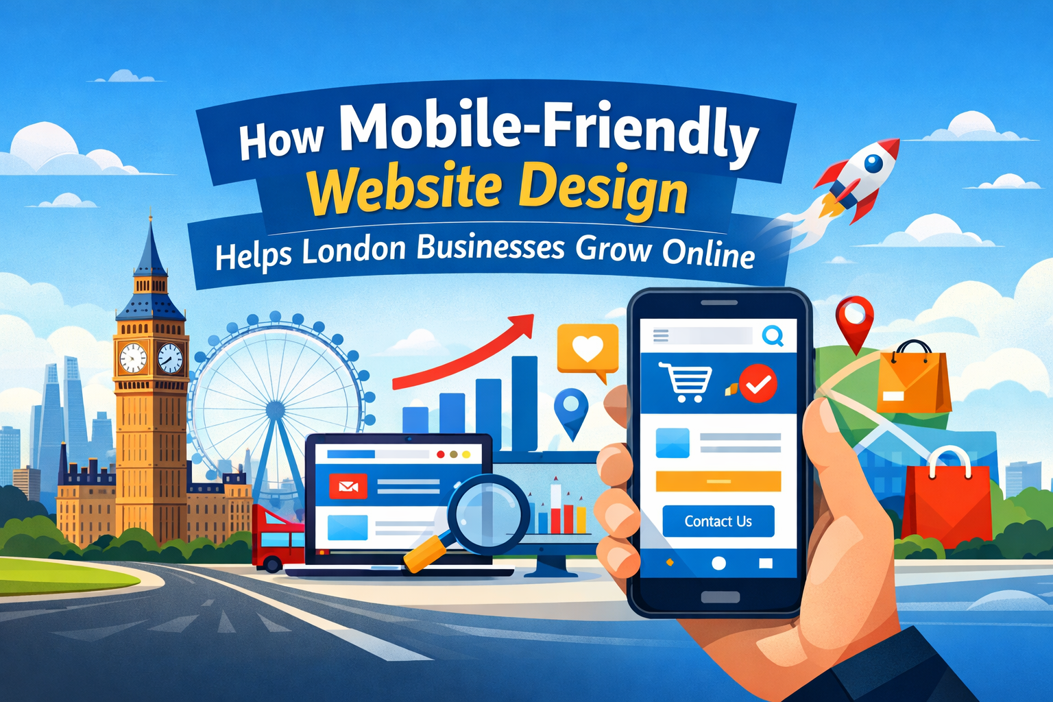
What this means for businesses:

  • A large percentage of users search for products and services using their phones
  • Customers often make quick decisions based on what they find online
  • Mobile searches frequently lead to immediate actions (calls, visits, purchases)
Imagine someone searching for a “coffee shop near me” or “best digital agency in London.” If your website loads poorly or looks broken on mobile, that potential customer will move on—instantly. First Impressions Happen on Mobile Your website is often the first interaction a customer has with your business. On mobile, this first impression is even more critical because users expect fast, smooth, and intuitive experiences.

A mobile-friendly design ensures:

  • Clean and readable text without zooming
  • Easy navigation with thumb-friendly menus
  • Fast loading pages
  • Visually appealing layouts that fit smaller screens
If users struggle to navigate your site, they won’t stay long enough to explore your services. A well-designed mobile experience builds trust and encourages engagement from the very first click. Improved User Experience Drives Engagement User experience (UX) plays a major role in how visitors interact with your website. A mobile-friendly design removes friction and makes it easier for users to take action.

Key benefits of better mobile UX:

  • Lower bounce rates: Visitors stay longer when the site is easy to use
  • Higher engagement: Users browse more pages and explore services
  • Better conversion chances: Smooth experiences lead to more inquiries and sales
For example, a London-based service provider with a simple “Call Now” button or easy contact form will see significantly better results than one with complicated navigation. Mobile Optimization Boosts SEO Rankings Search engines like Google prioritize mobile-friendly websites. This is due to mobile-first indexing, where Google primarily uses the mobile version of your site for ranking and indexing.

How mobile design impacts SEO:

  • Faster load times improve ranking signals
  • Mobile usability affects search visibility
  • Responsive design ensures consistent performance across devices
If your competitors have mobile-optimized websites and you don’t, they are more likely to appear higher in search results—taking your potential customers with them. Faster Loading Speeds Increase Conversions Speed matters—especially on mobile. London users expect websites to load within seconds. If your site takes too long, they’ll leave before it even appears.

Why speed is crucial:

  • 53% of users abandon a site that takes more than 3 seconds to load
  • Faster websites provide smoother browsing experiences
  • Speed directly impacts conversions and sales

Tips to improve mobile speed:

  • Optimize images and reduce file sizes
  • Use efficient coding practices
  • Enable browser caching
  • Choose reliable hosting
A fast mobile website keeps users engaged and encourages them to take action. Better Local Search Visibility Many London businesses rely on local customers. Mobile-friendly websites play a huge role in local SEO and “near me” searches.

Mobile optimization helps you:

  • Appear in local search results
  • Attract nearby customers actively searching for services
  • Provide quick access to location, contact details, and directions
When someone searches for a service nearby, Google prioritizes businesses that offer a strong mobile experience. This means your website design directly impacts how easily customers can find you. Higher Conversion Rates from Mobile Users A mobile-friendly website doesn’t just attract visitors—it converts them into customers.

Features that improve mobile conversions:

  • Click-to-call buttons
  • Simple forms with fewer fields
  • Clear calls-to-action (CTAs)
  • Easy checkout processes for eCommerce sites
When users can quickly contact you or complete a purchase without frustration, they are far more likely to follow through. Builds Brand Credibility and Trust In a competitive market like London, trust is everything. A poorly designed mobile site can make your business look outdated or unprofessional.

A strong mobile design helps:

  • Create a professional brand image
  • Build trust with first-time visitors
  • Show that your business keeps up with modern trends
Customers often judge your credibility based on your website. A smooth mobile experience signals reliability and quality. Supports Social Media Traffic Social media platforms are primarily accessed via mobile devices. If your business promotes services on platforms like Instagram, Facebook, or LinkedIn, users will likely visit your website from their phones.

Why mobile design matters for social traffic:

  • Ensures seamless transition from social media to your site
  • Keeps users engaged after clicking your links
  • Improves ROI on paid social campaigns
Without mobile optimization, you risk wasting valuable traffic generated through marketing efforts. Competitive Advantage in the London Market London is highly competitive across all industries. Businesses that invest in mobile-friendly design gain a clear advantage over those that don’t.

With a mobile-optimized website, you can:

  • Stand out from competitors with outdated sites
  • Capture more leads and inquiries
  • Provide a better overall customer experience
Even small improvements in mobile usability can make a big difference in how your business performs online. Future-Proofing Your Business Technology continues to evolve, and mobile usage is only expected to grow. Investing in mobile-friendly design now ensures your business stays relevant in the future.

Benefits of future-ready design:

  • Adaptability to new devices and screen sizes
  • Better compatibility with emerging technologies
  • Long-term cost savings by avoiding frequent redesigns
A responsive, mobile-first approach prepares your business for ongoing digital changes. Key Elements of a Mobile-Friendly Website To fully benefit from mobile optimization, your website should include:

Essential features:

  • Responsive design: Adapts to all screen sizes
  • Fast loading speed: Keeps users engaged
  • Simple navigation: Easy-to-use menus and layout
  • Readable content: Clear fonts and spacing
  • Strong CTAs: Encourages user action
  • Optimized images: High quality without slowing down the site
These elements work together to create a seamless mobile experience. Final Thoughts A mobile-friendly website is one of the most powerful tools for business growth in London. It impacts everything—from user experience and SEO rankings to conversions and brand perception. In a city where competition is fierce and attention spans are short, your website needs to perform flawlessly on mobile devices. Businesses that prioritize mobile optimization are better positioned to attract, engage, and convert customers in today’s digital landscape. Ready to Grow Your Business Online? If your website isn’t delivering the results you expect, it might be time for an upgrade. A well-designed, mobile-friendly website can transform your online presence and unlock new growth opportunities. Start optimizing today and make sure your business is always within reach—right in your customer’s pocket.